The debate between dark mode and light mode in UI design has been a hot topic in the digital design world. From mobile apps to websites, users are now given the choice to switch between the two. But is one better than the other? How do you, as a designer, decide which mode to prioritize?
This blog delves into the pros and cons of dark and light mode, highlighting key UI considerations that can influence user satisfaction, engagement, and accessibility.
Understanding Dark Mode and Light Mode
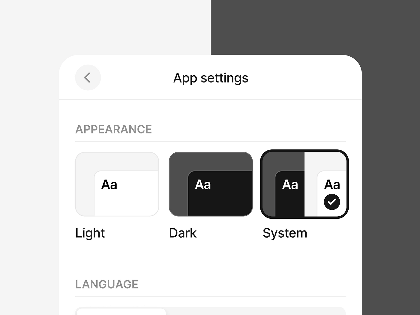
Dark mode features a darker background with lighter text, creating a low-light environment that reduces eye strain, particularly at night.Light mode, on the other hand, presents a bright interface with dark text, providing a clean and traditional experience that mirrors physical reading environments.
While some users prefer the sleekness of dark mode, others find light mode easier to read. Designing with both modes in mind ensures inclusivity and enhances user satisfaction.
Why Dark Mode is Gaining Popularity
Dark mode isn’t just a trend—it’s a shift driven by user demand and technological advancements. Major platforms like Apple, Google, and Facebook now offer dark mode options. But what makes it so appealing?
1. Reduces Eye Strain
In low-light environments, bright screens can be harsh on the eyes. Dark mode minimizes this strain, offering a more comfortable viewing experience at night.
2. Battery Efficiency
On OLED and AMOLED screens, dark mode can save battery life. Black pixels are essentially “off,” which conserves energy and prolongs device usage.
3. Aesthetic Appeal
Dark mode exudes a sleek, modern look. Many users associate it with sophistication, enhancing the visual appeal of apps and websites.
The Case for Light Mode
Despite the popularity of dark mode, light mode remains the default for most digital interfaces. Here’s why:
1. Superior Readability in Daylight
Light mode excels in well-lit environments. The contrast between dark text and light backgrounds enhances readability, reducing squinting and screen reflections.
2. Familiarity and Tradition
Light mode mimics traditional paper, which aligns with user habits and expectations. This familiarity reduces the learning curve and makes navigation intuitive.
3. Content Focus
With fewer visual distractions, light mode draws attention to the content. This makes it ideal for text-heavy interfaces, blogs, and news websites.

Key UI Considerations for Dark and Light Modes
Choosing between dark and light modes involves more than personal preference. Designers must consider usability, accessibility, and branding.
1. Contrast and Readability
- Dark Mode: Ensure there is enough contrast between text and background to avoid readability issues. Low contrast can lead to eye fatigue.
- Light Mode: Focus on reducing glare by using softer, off-white backgrounds instead of pure white.
Tip: Use tools like WCAG (Web Content Accessibility Guidelines) to ensure text contrast meets accessibility standards.
2. Accessibility and Inclusivity
Some users, particularly those with visual impairments, may struggle with dark mode. Offering the ability to switch between modes enhances inclusivity.
Best Practice:
- Include a toggle switch for users to choose their preferred mode.
- Save user preferences to improve accessibility over time.
3. Branding and User Experience
Dark and light modes can reflect your brand’s personality. Dark mode often aligns with tech-forward, luxury, or creative brands, while light mode conveys simplicity and clarity.
Example:
- Spotify uses dark mode by default, aligning with its sleek, entertainment-driven brand.
- Google employs light mode for search, reflecting simplicity and readability.
4. Consistency Across Devices
Users interact with your platform on different devices. Ensure that your design remains consistent in both modes across mobile, desktop, and tablet interfaces.
Tip: Test interfaces in both dark and light modes to identify inconsistencies or visual bugs.
Pros and Cons of Dark Mode
Pros:
- Reduces eye strain in low light
- Saves battery on OLED screens
- Modern and aesthetically appealing
Cons:
- Poor readability in bright environments
- Low contrast can strain eyes over time
- May not be suitable for all users
Pros and Cons of Light Mode
Pros:
- Better readability in daylight
- Traditional and familiar interface
- Highlights content effectively
Cons:
- Causes more eye strain in low light
- Higher battery consumption
- Can feel overly bright or harsh
When to Use Dark or Light Mode in Design
Choose Dark Mode:
- For entertainment apps (e.g., music, video streaming)
- In low-light-focused environments (e.g., gaming apps)
- To reduce battery consumption on mobile devices
Choose Light Mode:
- For content-heavy platforms (e.g., news, blogs)
- In daylight-use scenarios
- For corporate, medical, or educational interfaces
Implementing Both Modes: Best Practices
1. Offer a Toggle Feature
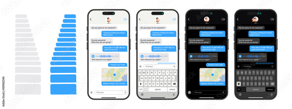
Give users control by allowing them to switch between modes. Place the toggle in an easily accessible area, such as the settings menu.
2. Use Dynamic Theming
Dynamic theming adjusts colors and contrast based on user settings. This creates a seamless transition between dark and light modes.
3. Test Extensively
Ensure that all elements—icons, buttons, and text—adapt well to both modes. Conduct usability tests to gather feedback.
4. Prioritize Content Over Aesthetics
While dark mode looks sleek, content readability should always take precedence. Balance aesthetics with practicality to enhance the overall user experience.
Conclusion
Dark mode vs. light mode isn’t a battle—it’s about offering choice. By understanding the strengths and limitations of both, you can design interfaces that cater to diverse user needs. Prioritize readability, accessibility, and user comfort to craft UI experiences that leave a lasting impression.
Ultimately, the best UI is the one that adapts to the user, not the other way around.
Master the art of crafting intuitive interfaces and unforgettable user experiences with our Advanced UI/UX Design Course. Gain hands-on skills, elevate your career, and create designs that leave a lasting impact.
Enroll now at Kaarwan and take your expertise to the next level!
FAQs
1. Is dark mode better for eye health?
Dark mode can reduce eye strain in low-light environments, but it’s not universally better for all users or scenarios.
2. Does dark mode save battery?
Yes, on OLED and AMOLED screens, dark mode conserves battery by turning off black pixels.
3. Should my app offer both dark and light modes?
Yes, providing both modes caters to a wider audience and enhances user experience.
4. How can I ensure readability in dark mode?
Maintain high contrast between text and background, and avoid using pure black and white combinations.
5. What industries benefit most from dark mode?
Entertainment, gaming, and productivity apps benefit the most, while text-heavy industries prefer light mode.